Brand Case Study: RailsBridge
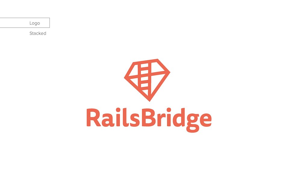
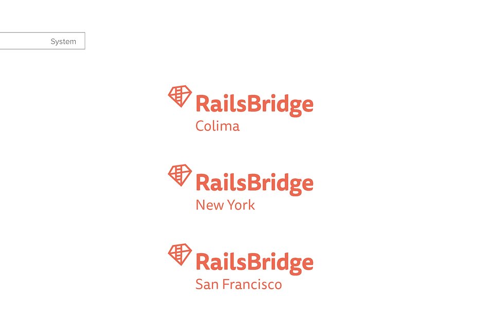
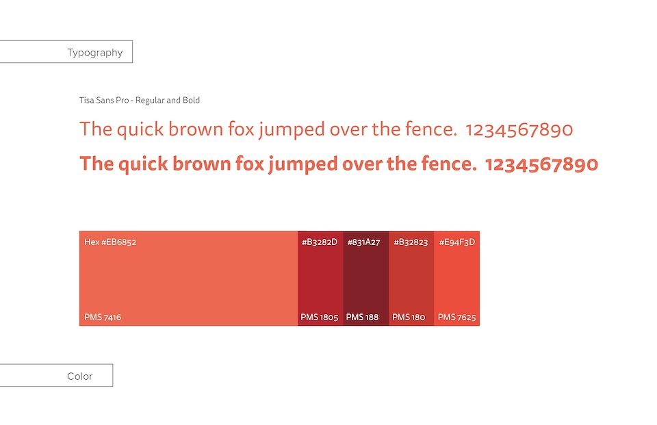
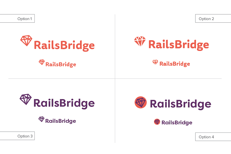
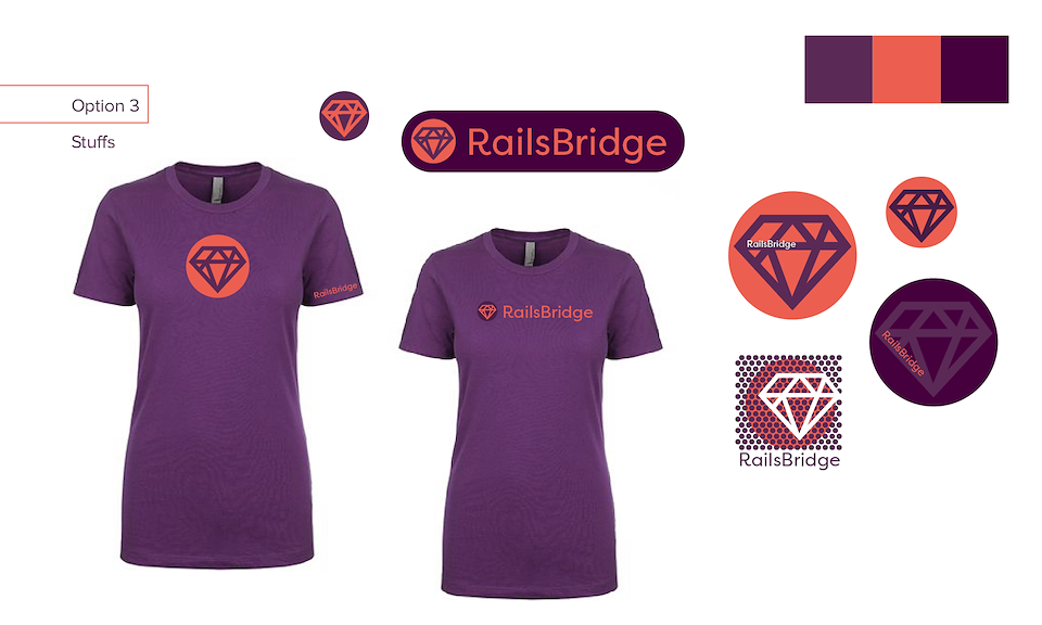
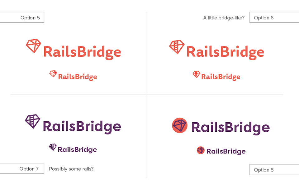
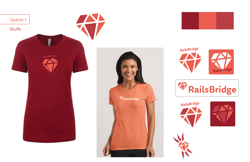
Using a ruby icon with a twist we invoke growth and learning, a core part of RailsBridge. Paired with cuddly yet bold type in orange we message warmth and friendliness.
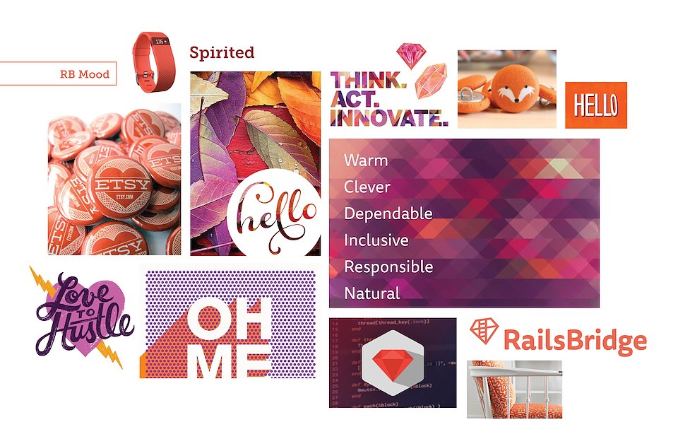

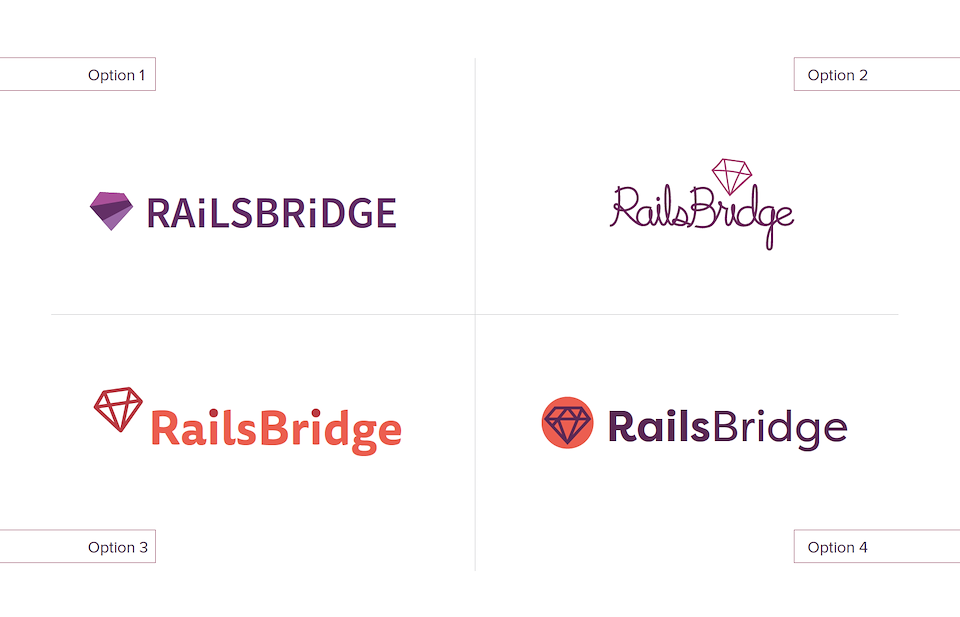
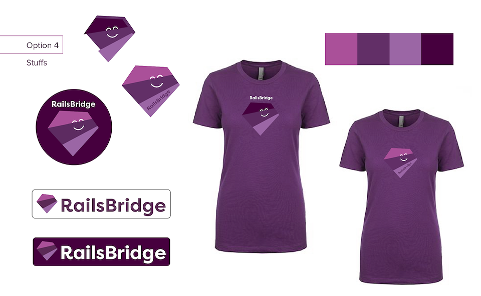
Trying on different options!
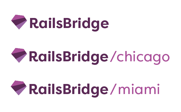
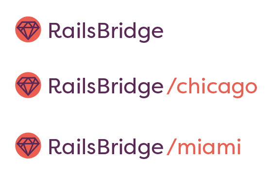

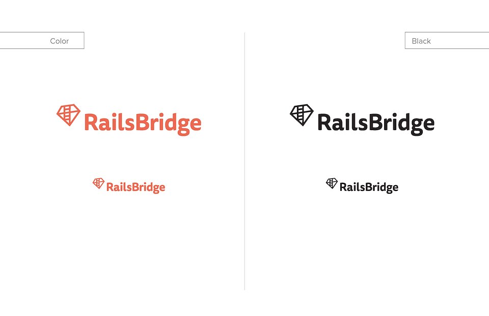
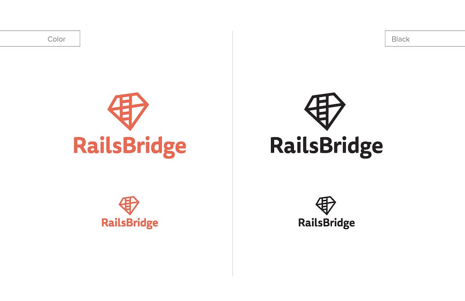
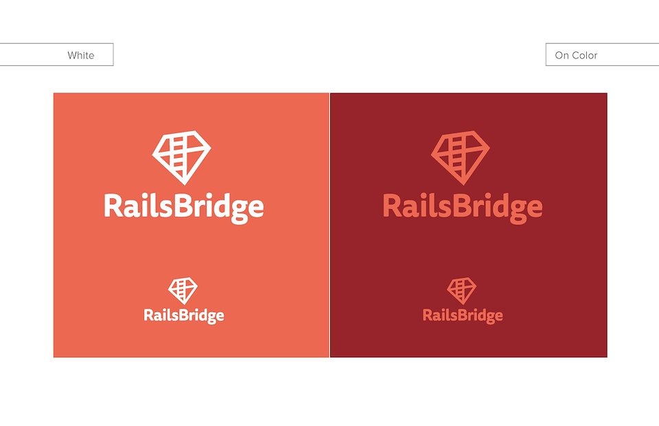
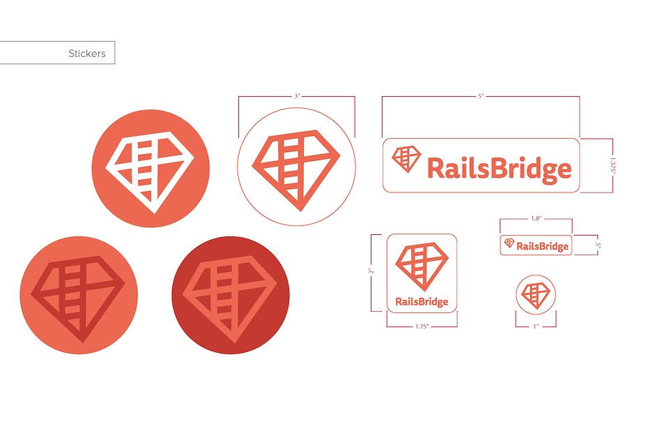
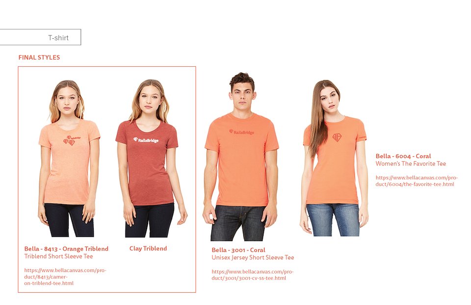
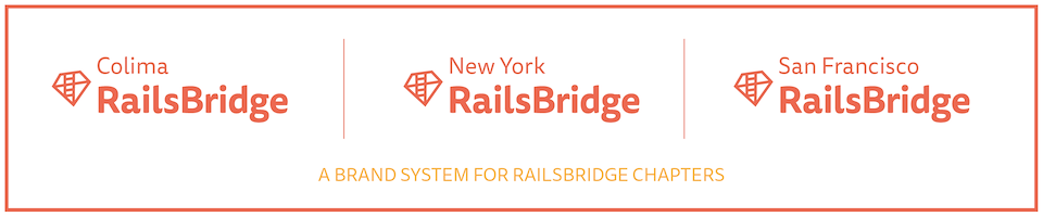
Final RailsBridge Logo
Description
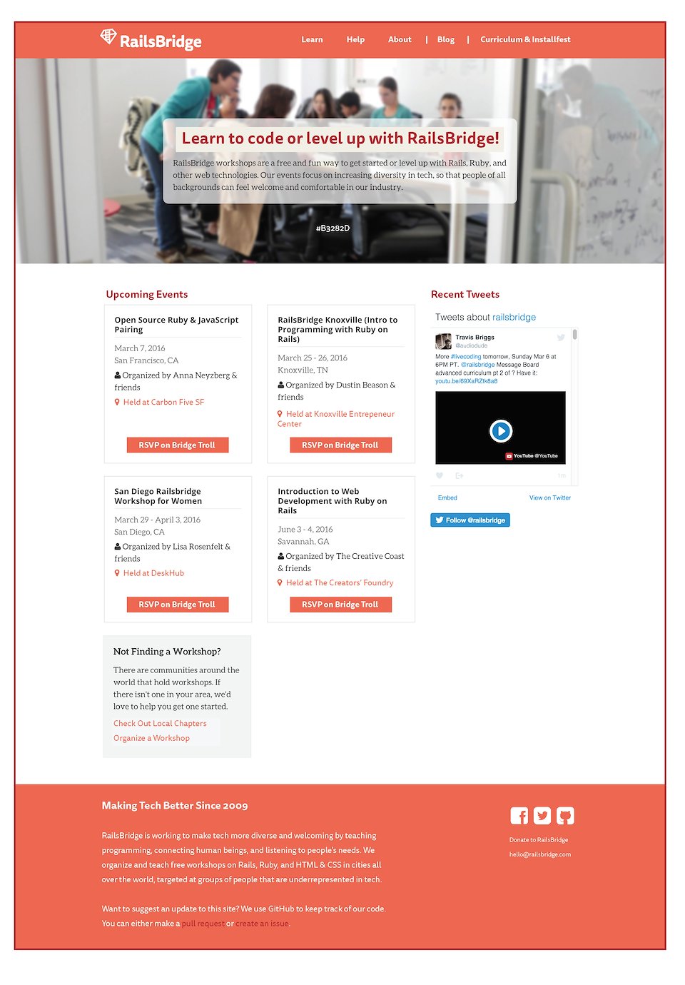
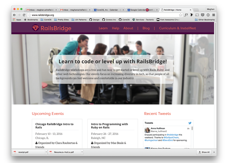
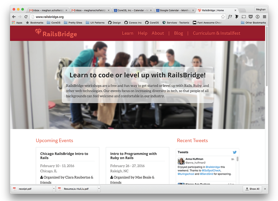
Project: Create a brand to showcase the personality and image of RailsBridge. An organization committed to increasing diversity in tech through teaching Ruby, Rails and other web technology.
I’d taken a break from side gigs to focus on my day job, but this project was too compelling to pass up. Together we built a brand using my “mega design process” (patent pending). It’s a way to design a brand that teaches the team about visual communication as we move through the design steps together. More here: https://blog.railsbridge.org/2016/03/21/railsbridge-has-a-new-logo/
Role
Primary Design (side gig)
For
RailsBridge